It's about time we revisit our vectorised vintage travel poster. In the last article, we discussed vector graphics and how they were well-suited for illustrations consisting of flat colours and simple shapes.
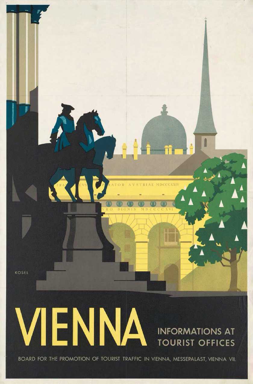
This time, we're going to take the design we recreated and explore an interesting optical illusion called the 'Parallax effect' by adding dimension to our poster. Here is the original poster design we picked to use as an example.
Vienna Travel Poster
- Artist: Kosel, Hermann, 1896-1983
- Created / Published: Austria, [193-]
- Description: 1 print (poster) : lithograph, color ; 93 x 61 cm. | Travel poster shows a view of Vienna.
Before we start exporting assets and diving into code, let's learn a bit more about the effect.
The Parallax effect is also known as Parallax scrolling. Wikipedia describes it as "a technique in computer graphics where background images move past the camera more slowly than foreground images, creating an illusion of depth in a 2D scene of distance."
The effect grew out of the multiplane camera technique used in traditional animation since the 1930s, most famously by Walt Disney Studios in the production of Snow White and the Seven Dwarfs (here's a fun explainer).
"Only three of those original Disney multiplane cameras still exist."
I was lucky enough to see one in person visiting Paris a few years back.
Today the illusion is used everywhere from film and television, to video games and websites, and can achieve a wide variety of results depending on how it's implemented. It can be as complex, or as simple as you need it to be.
In fact, some of the reasons I chose this particular poster in the first place (flat colours, simple shapes, strong perspective) also make it ideal to demonstrate the parallax effect.
All about layers
When we created our vector illustration, we grouped elements together based on how far away they appeared to be, eg. the domes and spires in the distance would be furthest back, and the statues closer to the front.
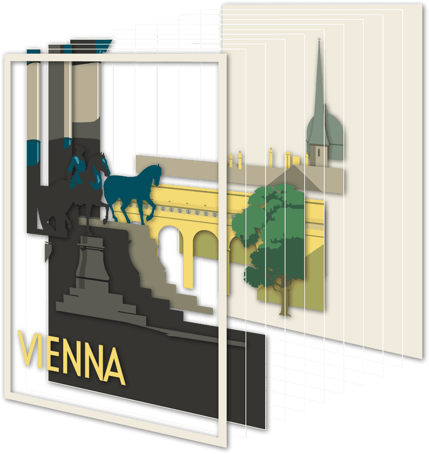
The grouping of elements mentioned above is very important but it's not an exact science and some creativity is required. For this design, I had to rely on guesswork in places (imagining some of the details being obscured by the tree for example). After arranging our layers into groups, we can flatten each of those groups down to single layers, then save and export them.
You can see what the assets used in this particular design look like here (feel free to download them if you want to try experimenting with parallax yourself).
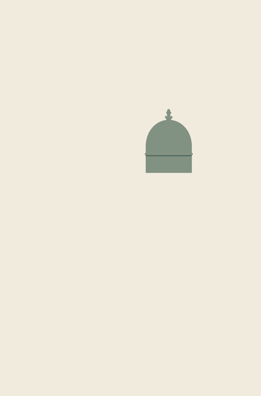
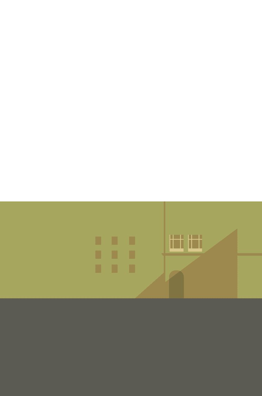
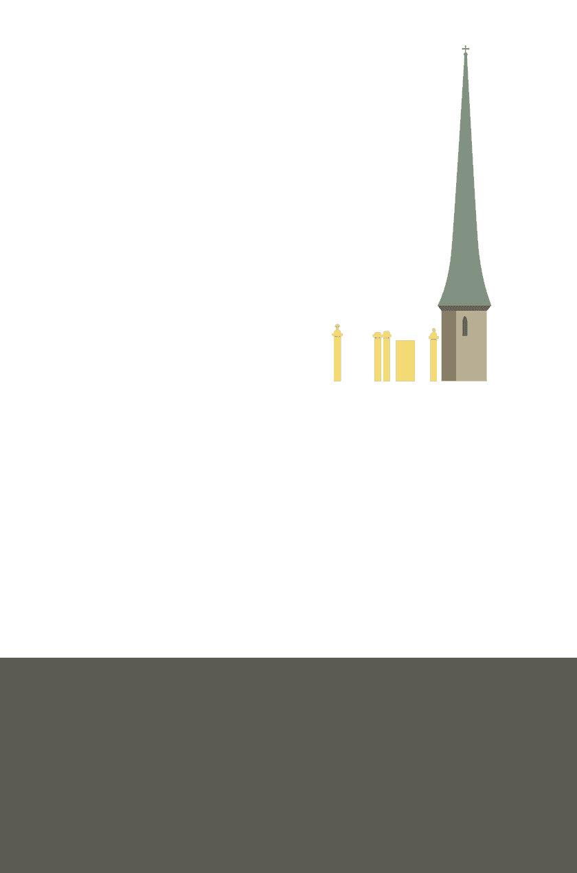
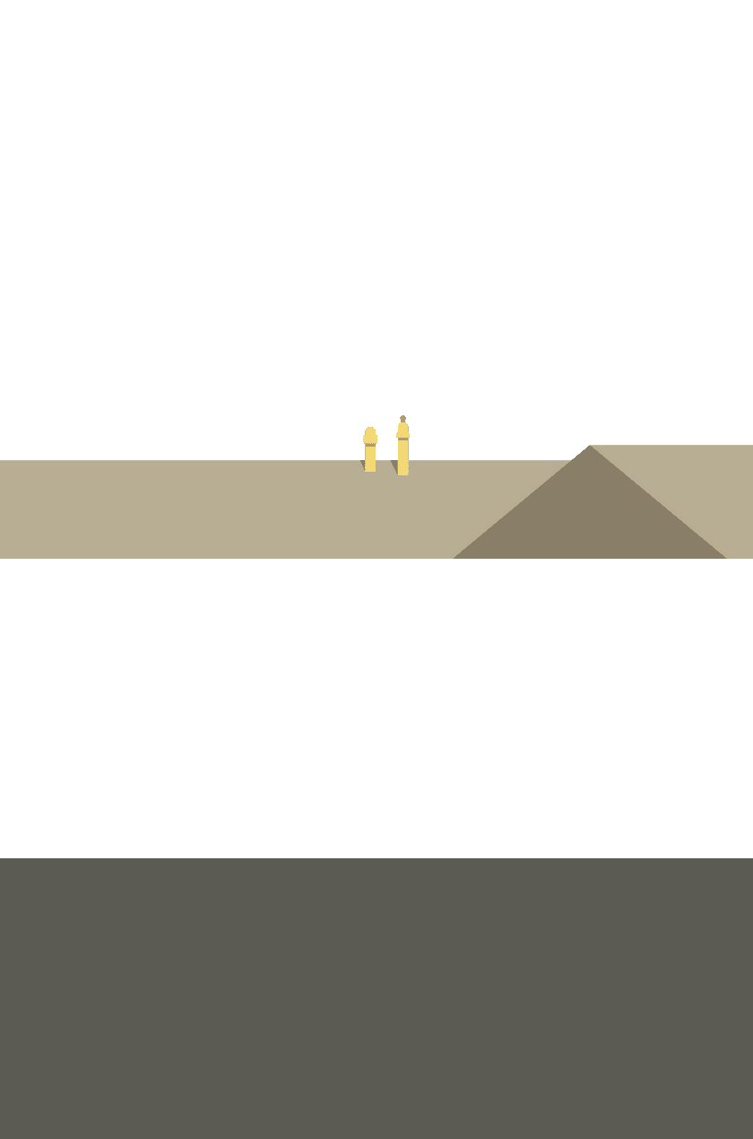
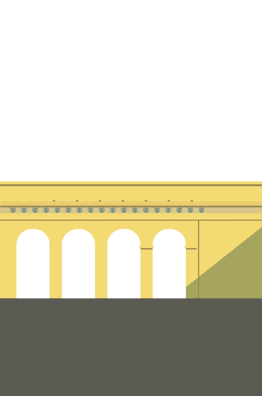
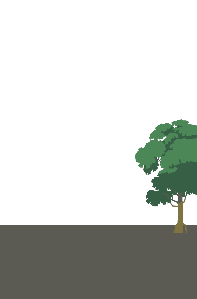

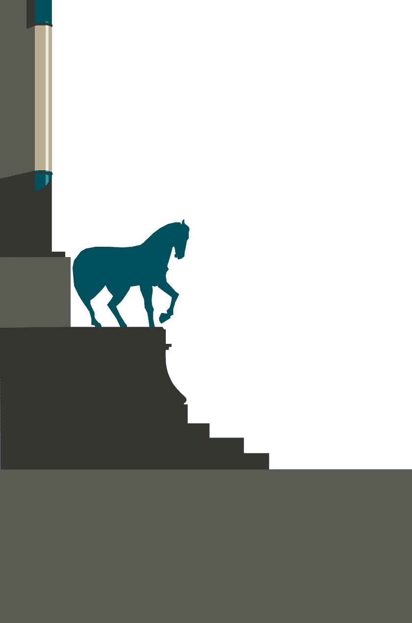

"But don't forget. The illusion only works with movement."
So now we'll try and create a parallax effect by positioning these layers on top of each other and subtly shifting their positions as we scroll. The key to making the effect look convincing is scrolling the layers at different speeds. (Most commonly, the topmost layer moves the fastest, and each subsequent layer moves a little slower.)
Making it work
Let's take a look at two different examples. One that scrolls vertically, and a more advanced example that uses your cursor position to move the layers around. Interact with each to see them in action.
Let's take a look at an example. Drag the image up and down to see it in action.


So, how do we achieve this?
These two examples work in very different ways. The most obvious difference is that the 'scrolling' speed is inverted, ie. One has the back layers moving slowest, and the other has them moving fastest.
Let's focus on the first (slightly simpler) example for now and take a closer look at the code that makes it work.
Scrolling up and down, you can see that the layers appear to move at different speeds (slower at the back, faster at the front). This isn't exactly what's happening though.
It'll become clearer if we examine the code that makes it work.
    # Here's how we've arranged the individual layers in the html.
    # Note the frame, '/Vienna-Vector-09.png', is kept separate as it doesn't move.


    <div class="parallax__wrapper">
        <div class="frame">
            <img src="/Vienna-Vector-09.png" alt="" />
        </div>
        <div class="parallax scene" id="scene">
            <div class="parallax__layer parallax__layer__1">
                <img src="/Vienna-Vector-00.png" alt="" />
            </div>
            <div class="parallax__layer parallax__layer__2">
                <img src="/Vienna-Vector-01.png" alt="" />
            </div>
            <div class="parallax__layer parallax__layer__3">
                <img src="/Vienna-Vector-02.png" alt="" />
            </div>
            <div class="parallax__layer parallax__layer__4">
                <img src="/Vienna-Vector-03.png" alt="" />
            </div>
            <div class="parallax__layer parallax__layer__5">
                <img src="/Vienna-Vector-04.png" alt="" />
            </div>
            <div class="parallax__layer parallax__layer__6">
                <img src="/Vienna-Vector-05.png" alt="" />
            </div>
            <div class="parallax__layer parallax__layer__7">
                <img src="/Vienna-Vector-06.png" alt="" />
            </div>
            <div class="parallax__layer parallax__layer__8">
                <img src="/Vienna-Vector-07.png" alt="" />
            </div>
            <div class="parallax__layer parallax__layer__9">
                <img src="/Vienna-Vector-08.png" alt="Scroll to see the effect" />
            </div>
            <div class="parallax__cover">
                <div class="cover-wrapper">
                </div>
            </div>
        </div>
    </div>
If you were to view this in a browser right now, it would show you all the layers separated out in a line. It wouldn't look anything like the original poster design. So how do we fix this?
    # Using css, we make sure the layers are all sat on top of each other.


    .parallax__layer{
        position: absolute;
        top: 0;
        right: 0;
        bottom: 0;
        left: 0;

        img{
        display: block;
        position: absolute;
        bottom: 0;
        }
    }
With the layers all stacked together, the result should look just like the original design. We're nearly there. Now all we need to do is make each layer scroll at different speeds.
    # We increment the transform values, 'translateZ' and 'scale', for each layer in css.


    .parallax__layer__1 {
        transform: translateZ(-500px) scale(6);
    }

    .parallax__layer__2 {
        transform: translateZ(-450px) scale(5.5);
    }

    .parallax__layer__3 {
        transform: translateZ(-400px) scale(5);
    }

    .parallax__layer__4 {
        transform: translateZ(-350px) scale(4.5);
    }

    .parallax__layer__5 {
        transform: translateZ(-300px) scale(4);
    }

    .parallax__layer__6 {
        transform: translateZ(-250px) scale(3.5);
    }

    .parallax__layer__7 {
        transform: translateZ(-200px) scale(3);
    }

    .parallax__layer__8 {
        transform: translateZ(-150px) scale(2.5);
    }

    .parallax__layer__9 {
        transform: translateZ(-100px) scale(2);
    }
As you can see, we're not 'strictly' scrolling the layers at different speeds at all.
We're using translateZ to move the layers further 'back' in 3D space and then scaling them to line back up with their original position. Each layer is 'technically' scrolling at the same speed. It's just that the layers furthest back appear to be moving more slowly...
... exactly like how we perceive distant objects in real life.
Pretty cool. Hopefully that all made sense.
The more advanced example, using cursor position, requires javascript. I won't go into detail in this article, but you can find out how it works here.
You can find a more advanced example, that uses cursor position, here. If you don't need a CSS-only solution, the scope for what you can do using parallax changes completely.