There's a list of topics I wanted to cover in this journal and working with vector graphics is an interesting one. So today we'll take a look at what exactly vector graphics are and why they're such an important tool for web developers.
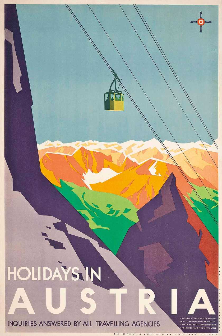
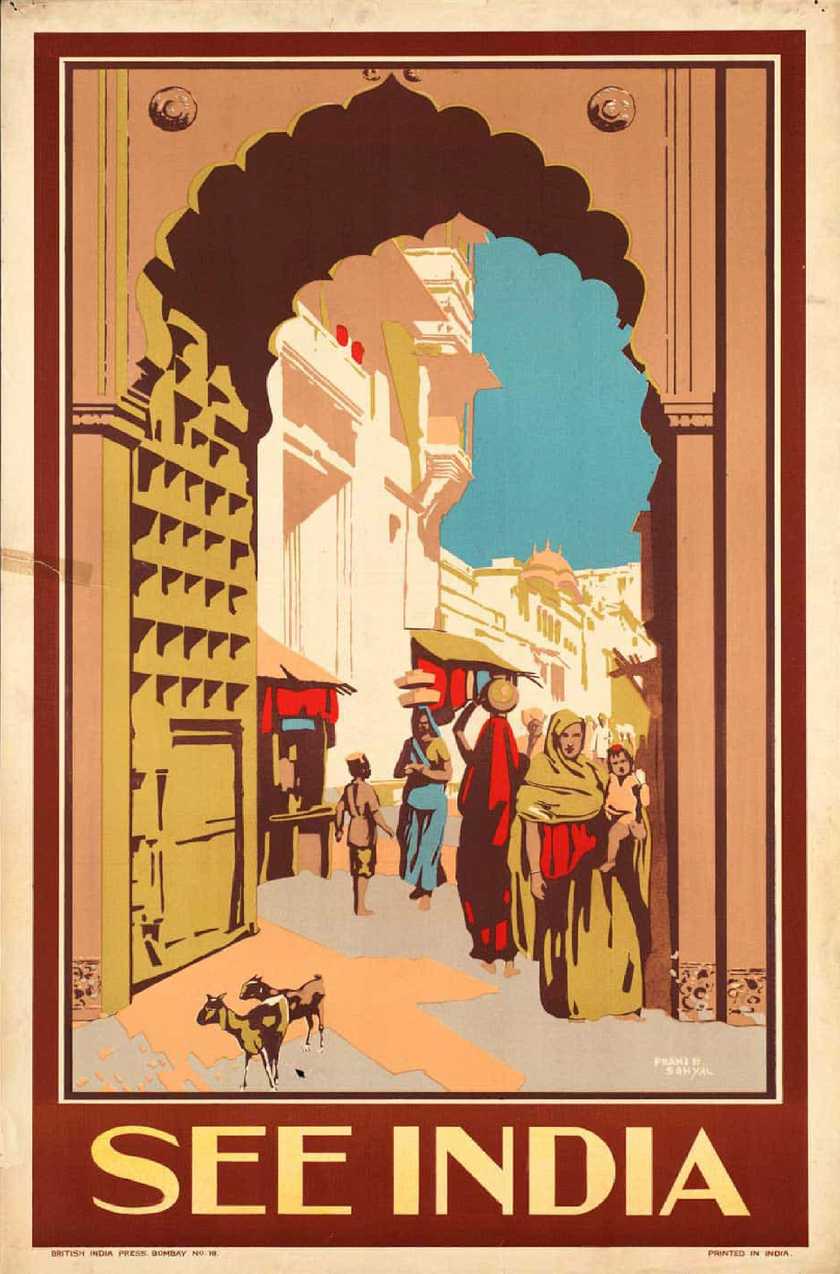
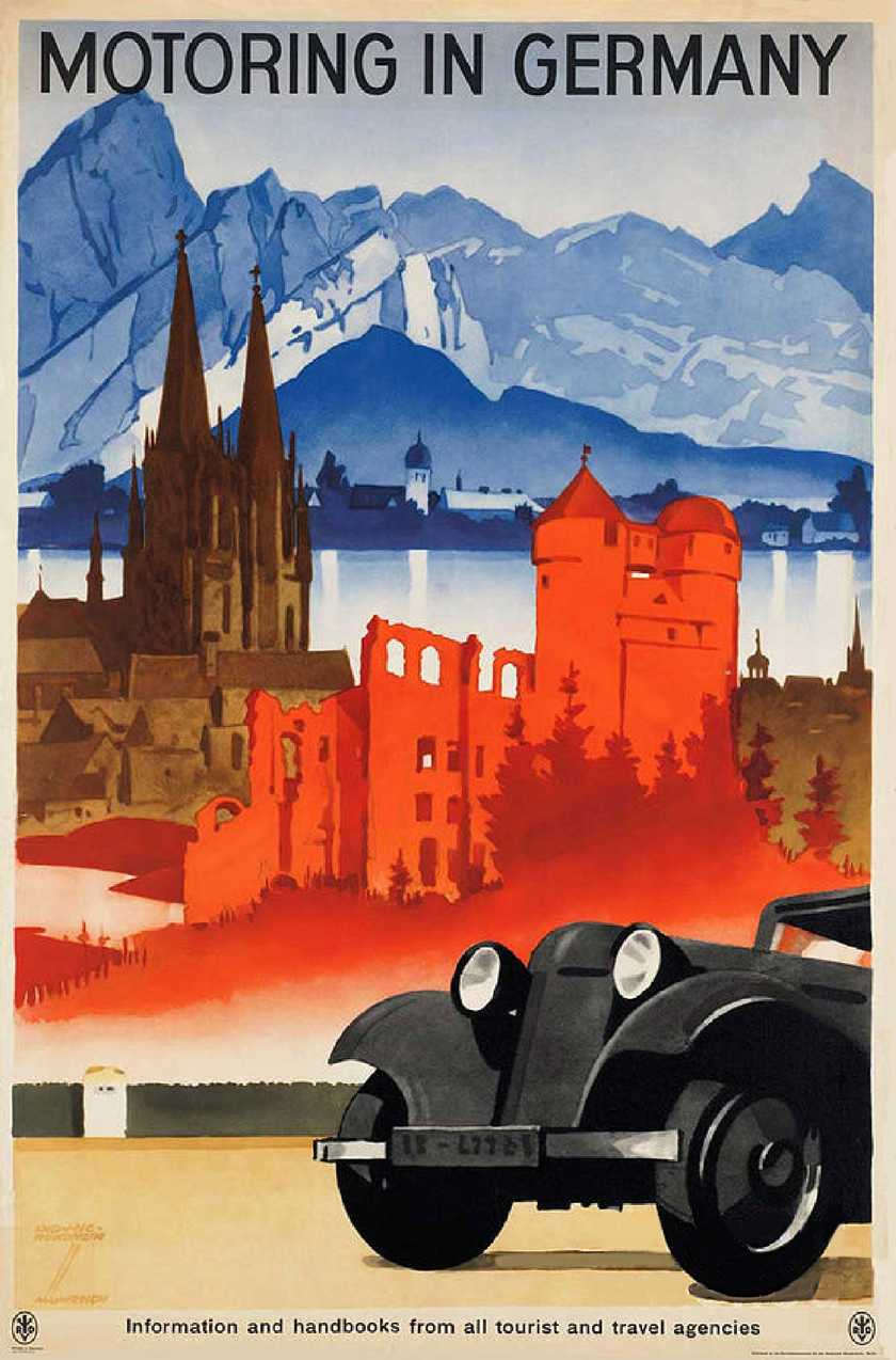
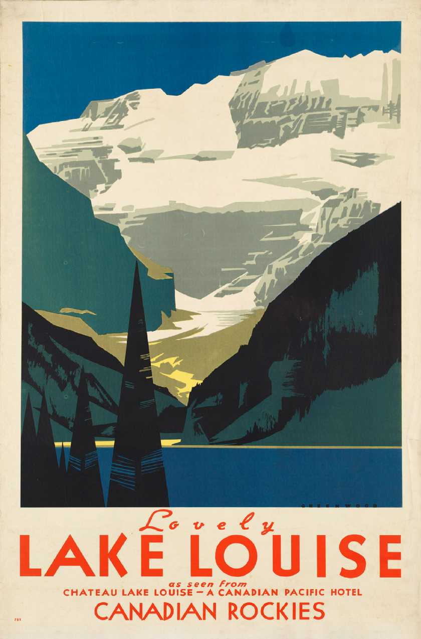
As it happens, I've been looking for an excuse to practice illustrating something vector-based for a while, and there's a subject near and dear to my heart that would be a perfect fit for this... Vintage travel posters.
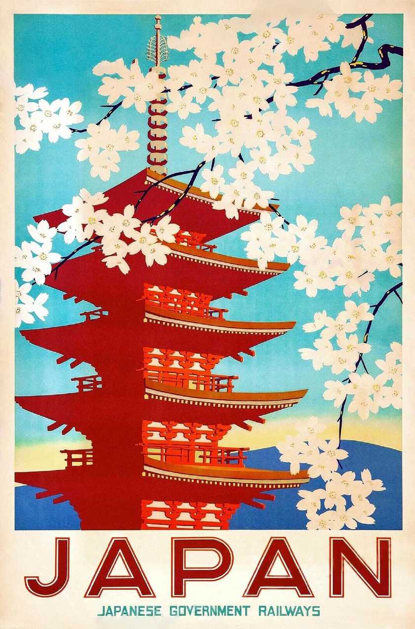
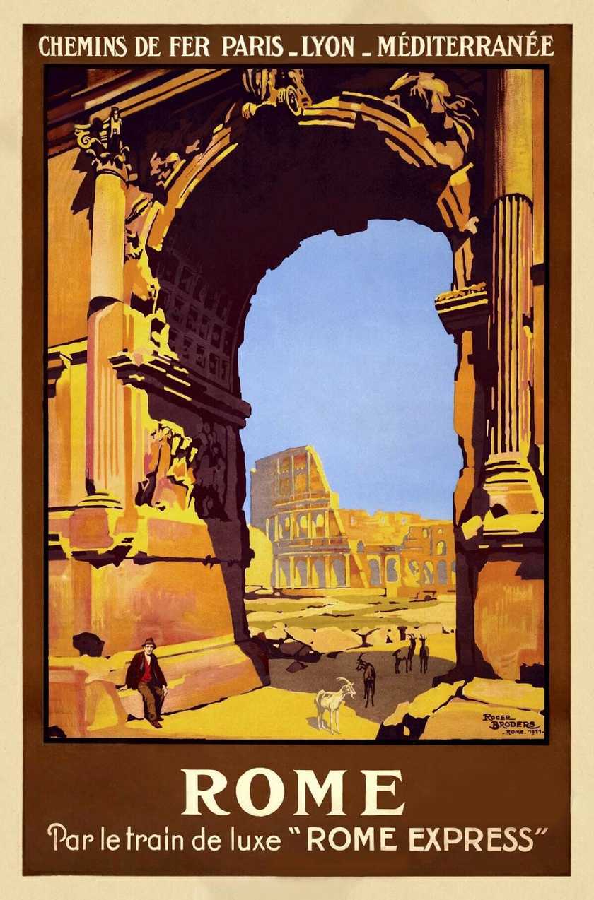
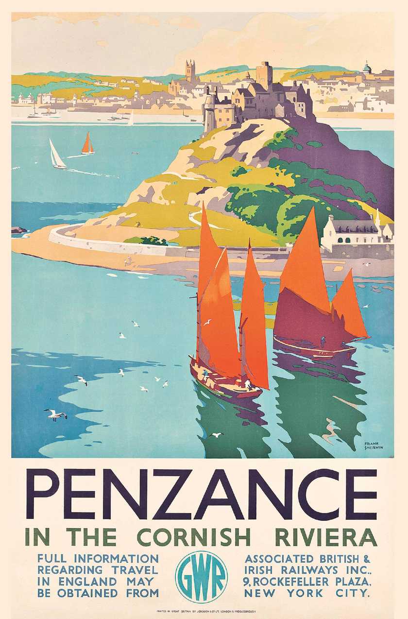
"Vintage travel posters, especially those from the 1910's and 20's, are absolutely beautiful."
They're visually dynamic and evoke a more romantic, adventurous sense of travel than we know today. They also have a few interesting design choices in common.
Namely, a limited colour palette and a strong perspective. Many of them use simplified shapes and flat colours too, and it's these reasons that make them well-suited for design using vector graphics.
So, what is a vector graphic?
Vector Graphics
Wikipedia says; "Vector graphics are computer graphics images that are defined in terms of 2D points, which are connected by lines and curves to form polygons and other shapes."
In layman's terms, vector graphics are images made out of maths instead of pixels. Like drawing a square using four coordinates rather than lots of smaller squares. There are advantages and disadvantages to using them.
Because they're not made out of pixels, you can scale them infinitely and they will stay crisp and sharp (no blurry pixelated mess like in the screenshot below). For this reason, they're referred to as SVGs, or scalable vector graphics when talking about them in regards to web development.
Also, because an SVG is made up of coordinates instead of pixels, they are often much smaller in file size compared to bitmap images. The main disadvantage to SVGs is their inability to render smooth gradients or lots of tiny details very easily. That's why photos are never rendered using vector graphics.
However they are very well suited for things such as icons or simple illustrations.
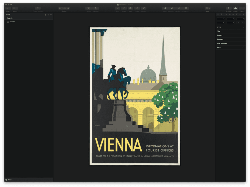
Which brings us to our vintage travel poster:
Vienna Travel Poster
- Artist: Kosel, Hermann, 1896-1983
- Created / Published: Austria, [193-]
- Description: 1 print (poster) : lithograph, color ; 93 x 61 cm. | Travel poster shows a view of Vienna.
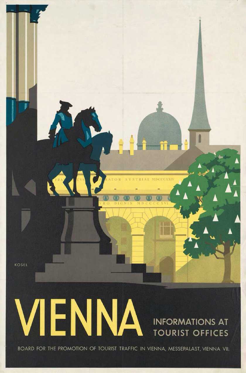
This travel poster for Vienna is an ideal example of the type of design that translates really well to a vector illustration. It has clear contrasting lines, flat colours, and a relatively small amount of detail.
What's even more useful is that we can clearly make out which elements are sat in front of each other. This might not sound like much, but it means we can deconstruct the image and play with the perspective using an effect called parallax (but we'll save that for another time).
For now, let's get started turning this vintage poster design into a nice clean vector illustration.
Creating SVGs
There are many different ways to work with vector graphics, Adobe Illustrator being a well-known example, but my preferred tool is an app called Sketch. It's only available for Mac but has a lot of incredible features and is especially useful when designing UI or prototyping software.
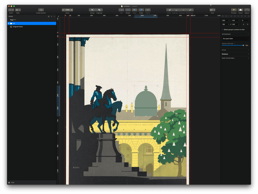
For a project like this, I can use the original poster design as a template to draw shapes over the top of. This ensures my vectorised version is as accurate as possible. So let's start by importing the original poster into Sketch.
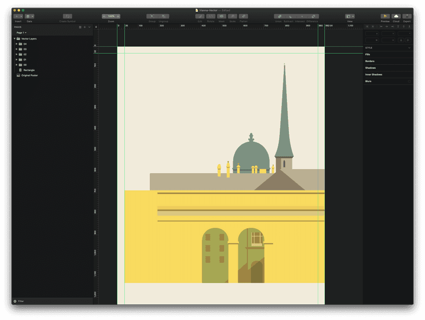
The very first shape we're going to recreate is the large dome. This is because it's the object furthest back and doesn't sit in front of any other elements.
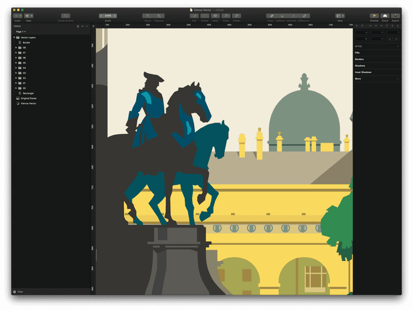
As we recreate individual elements of the design using simple shapes, we can see the picture starting to appear. Keep working forwards from the back.
More complicated shapes take longer to draw but just keep plotting your points around the outline of the shape and eventually you'll have another element.
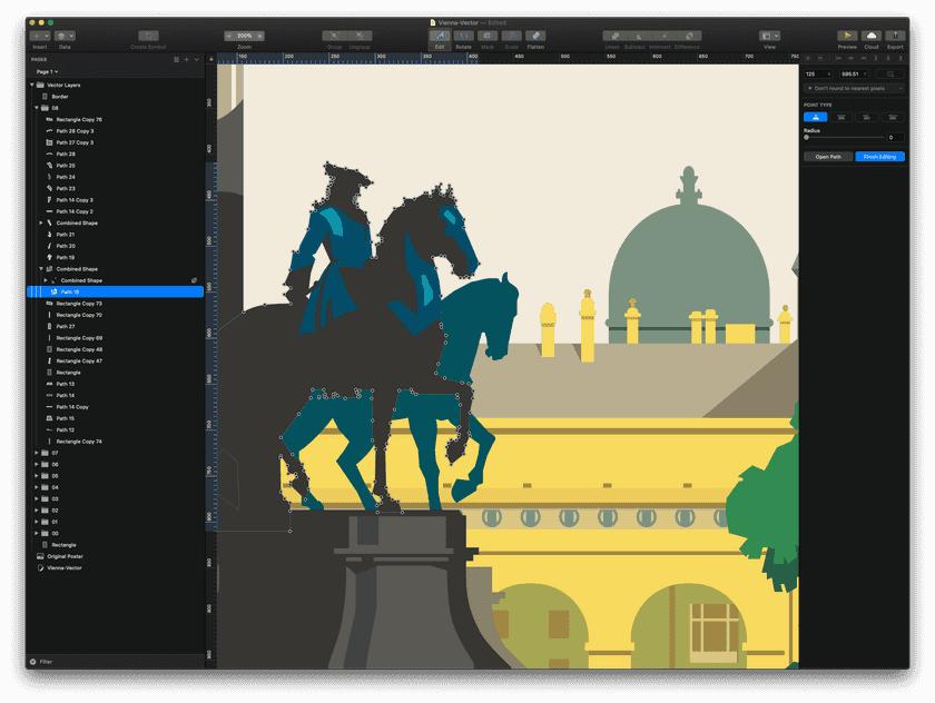
You can see just how many coordinate points this horse and rider have. The lighter blue highlights on the figure are separate vector shapes too!
Each new shape you draw builds up detail, and eventually you'll have a lot of different elements. That's why it's a good idea to organise these elements into groups as you go (the horse and rider in the foreground could be grouped with the highlights, and possibly even the highlights for the plinth it stands on).
Layers
We can split this design into layers by estimating how distant each element is from the viewers' perspective. Apart from being a neat way to organise our work, we can use these later to create an interesting visual effect.
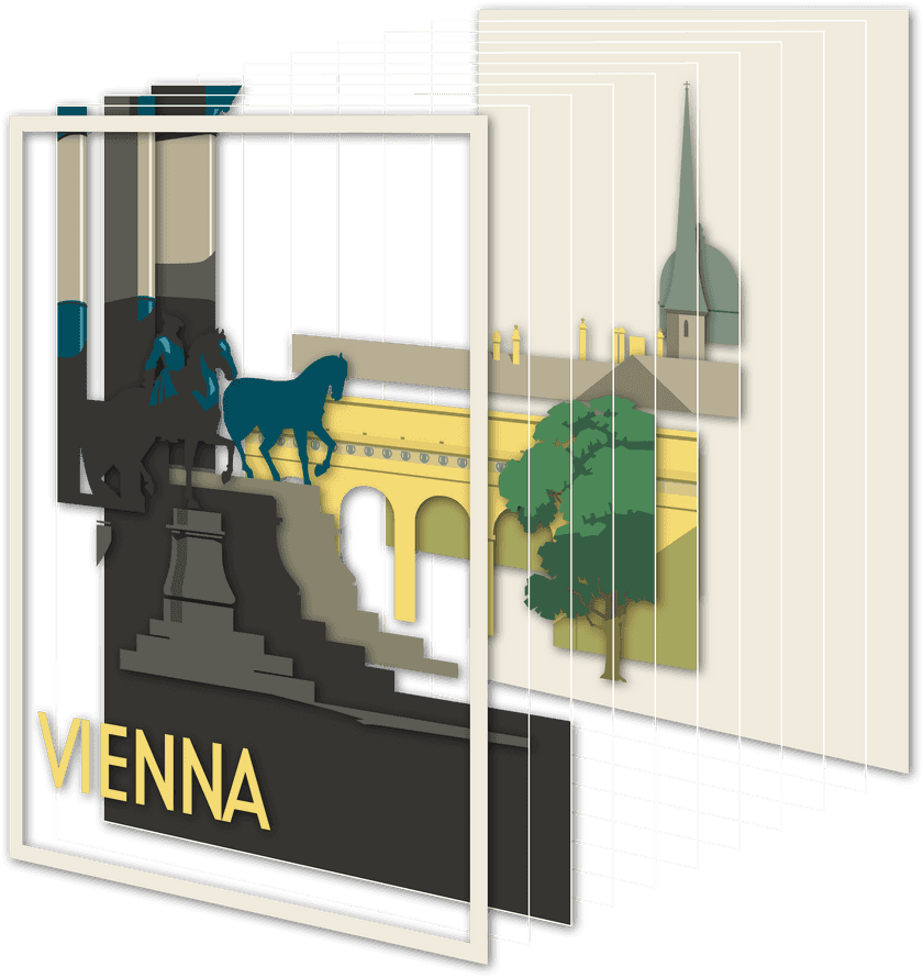
You can see how a more complicated illustration would take a long time to create using vector graphics. That's partly the reason I've opted to use this relatively simple vintage travel poster as an example.
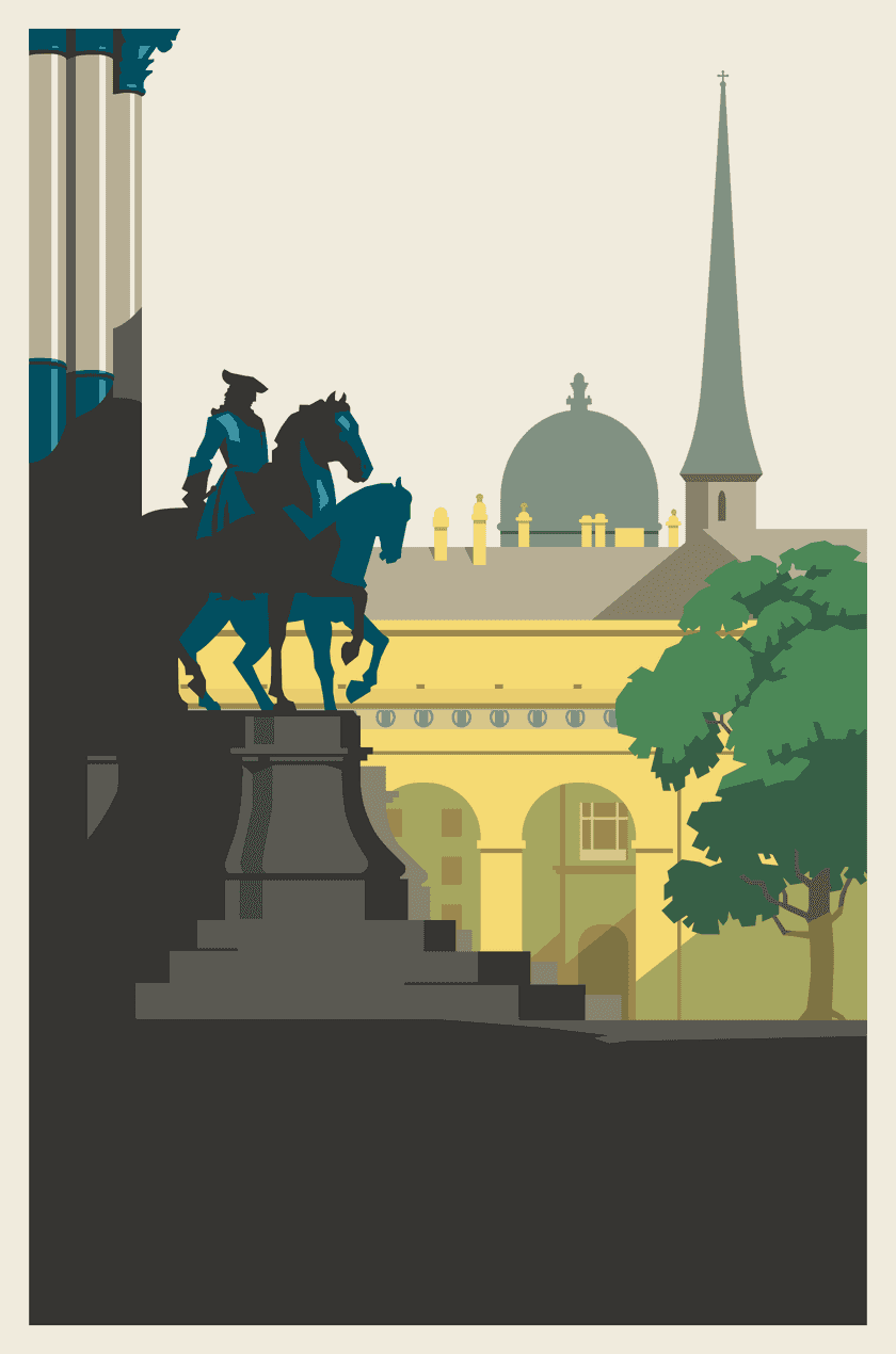
Once finished, we have a nicely crisp and sharp recreation of the original design.
This is now a vectorised version of the Vienna travel poster that can scale infinitely without losing definition. I'll revisit this in a future article and use the individual layers to create a sense of depth by utilising the parallax effect.
Update: You can now read the follow-up article here.
